When UX attacks

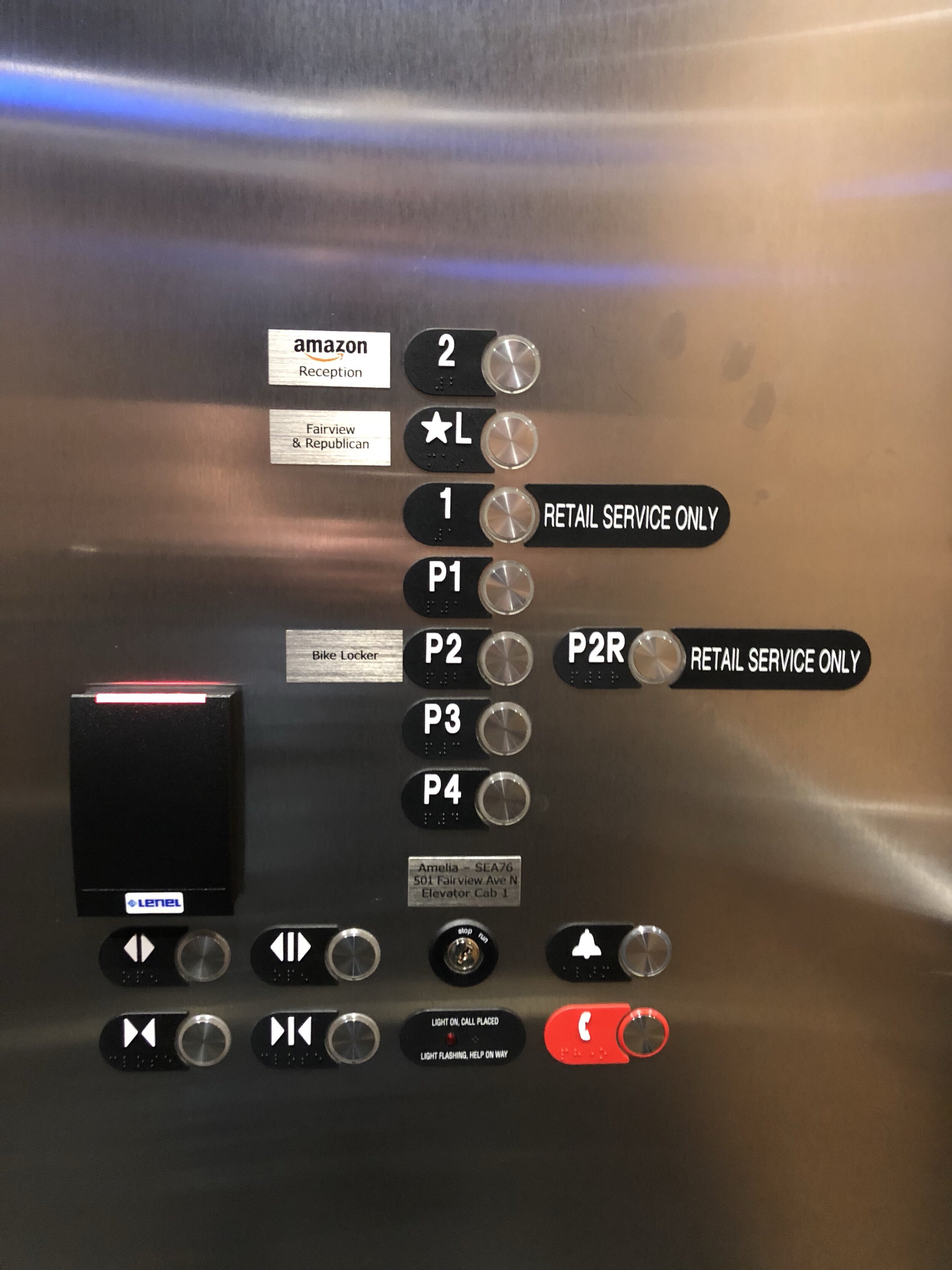 I wrote about this elevator before, but it's sprouted new appendages since then. And I'm also had some more thoughts about the problems as well.Let me describe the building first. From the bottom, P4, P3, P2, P1, and Lobby all open the door I will say is "back." P2R, 1, and 2 all open "front." Yeah, it's one of the confusing elevators with two sets of doors.Then you look at this more.Why the hell is P2R off to the side? It's opening on the same side as 1 and 2. Huh?Now look at the open/close buttons. Yes, there is a difference in iconography between "front" and "back" as symbolized by the vertical bar. But you also have to think that in no case are you are on a floor where both are a valid option. Open and close, without the redundant controls, would work just as well.Then you have the card reader with no information. It's always red and I've never had to scan a card.It's like someone checked off all the boxes without actually thinking "why?"